In Logos We Trusted
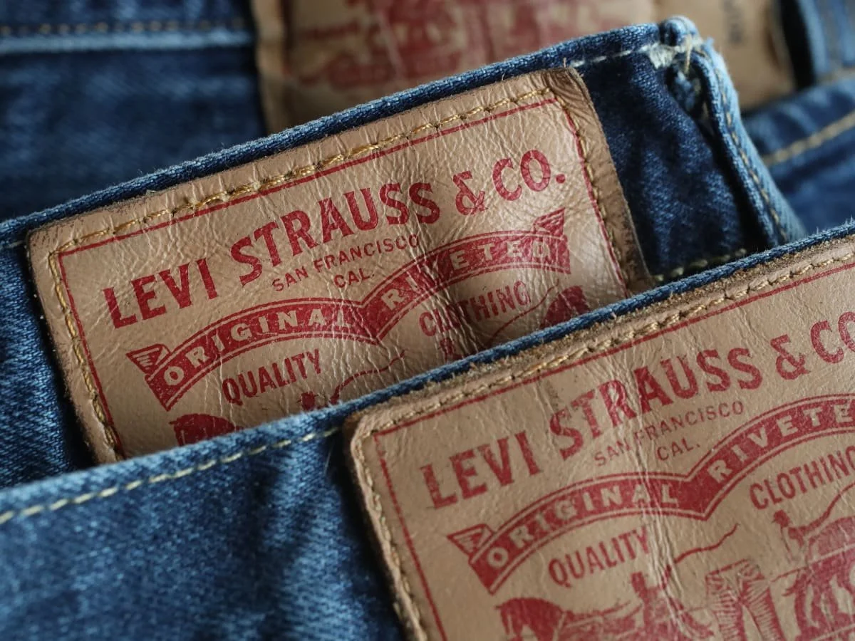
In the late 19th and early 20th centuries, industrial capitalism flooded cities with near-identical goods–soap, cigarettes, denim–all mass-produced and competing for attention. To stand out and to sell, companies turned to a new visual tool: the logo. Levi’s red tab, introduced in 1936, helped buyers spot real denim from knockoffs. The birth of the logo was a visual contract that promised a certain standard, a quiet reassurance that consumers could feel secure in their choices.
As the 20th century progressed, logos took on new dimensions. The advertising boom of the mid-century saw the logo become a tool of emotional persuasion. It wasn’t just about authenticating the product anymore, but the feeling associated with the brand–Kellogg’s conveyed wholesome domesticity and Marlboro masculinity, to name a few. Logos shifted from signifiers of quality to something more, promising both authenticity and a personality to come with it. This was branding as psychology, selling not a product but a lifestyle.
By the 1990s, logos had evolved into more than symbols of belonging, cultural currency. They became tools of social signaling in an increasingly image-driven world. Supreme’s box logo, introduced in 1994, was designed to be both brand recognition and the product itself. Borrowed from Barbara Kruger’s anti-capitalist art, ironically became a totem of hyper-capitalist exclusivity. Logos from brands like Tommy Hilfiger, Louis Vuitton, and BAPE operated in a unique limbo acting as both identifiers and broadcast symbols, visualizing proof that the wearer was culturally tuned in.
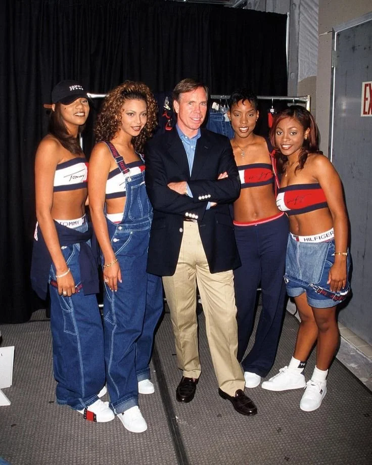
On the Left: Nigo, the founder of A Bathing Ape pictured his brand head-to-toe; On the Right: Destiny’s Child in complete Tommy Hilfiger outfits, pictured with Tommy Hilfiger himself
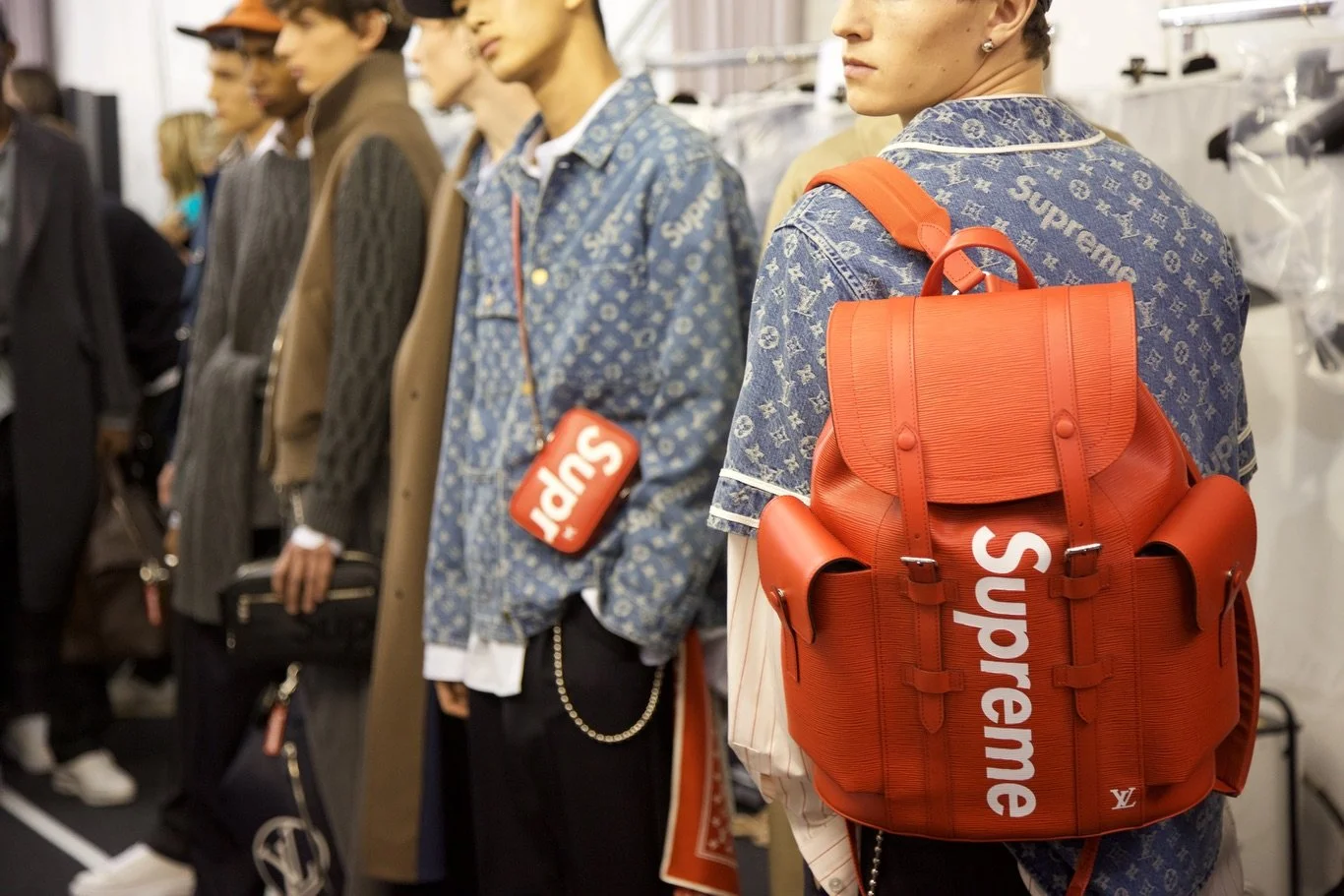
The 2010s marked peak logo culture and the height of the hypebeast era–where streetwear and luxury merged into a spectacle economy. And within this peak, Supreme, once a skate shop with a recognizable logo, was a global culture machine. What crystallized this moment was its collaboration with Louis Vuitton, where monograms and box logos intertwined across everything from trunks to skateboards. The collection was more than meta, it was market-aware, providing fashion for mere visibility and proof of access. Owning a piece from the drop was like reaching Mount Rushmore status in the hypebeast era. At its apex, the logo became a badge of access, awareness and insider status in the culture world.
In the aftermath of the hypebeast era, the 2020s have been marked by a notable silence. The brands that defined the 2010s began to feel overexposed, even hollow. Where one logo could signal in-group knowledge, it now feels massified and flattened by resale platforms, fakes, and online culture. Most notably, through the rise of short-form social media, a new generation of consumers emerged. TikTok, with its rapid-fire scroll and accelerated trend cycles, turned the flex into a fleeting moment. In a landscape where everything is visible all the time, visibility itself loses its edge. Wearing overt logos is less of a flex and now more of a symbol of conformity–something very algorithmic.
For Gen Z, a generation raised online and trained by algorithms, overt branding feels like trying too hard. Once shorthand for value or cultural clout, the logo now reads more like a marketing ploy rather than a marker of taste. Younger generations are fluent in brand strategy and can spot a targeted drop or PR stunt without feeding into its purpose. The algorithm has trained the average user to decode value differently, and in return, subtlety or knowing has become the new status symbol. This is status for the algorithmic age: a style of anti-style, where the highest signal is how little you appear to be signaling. You don’t need to shout when you know the right people are watching.
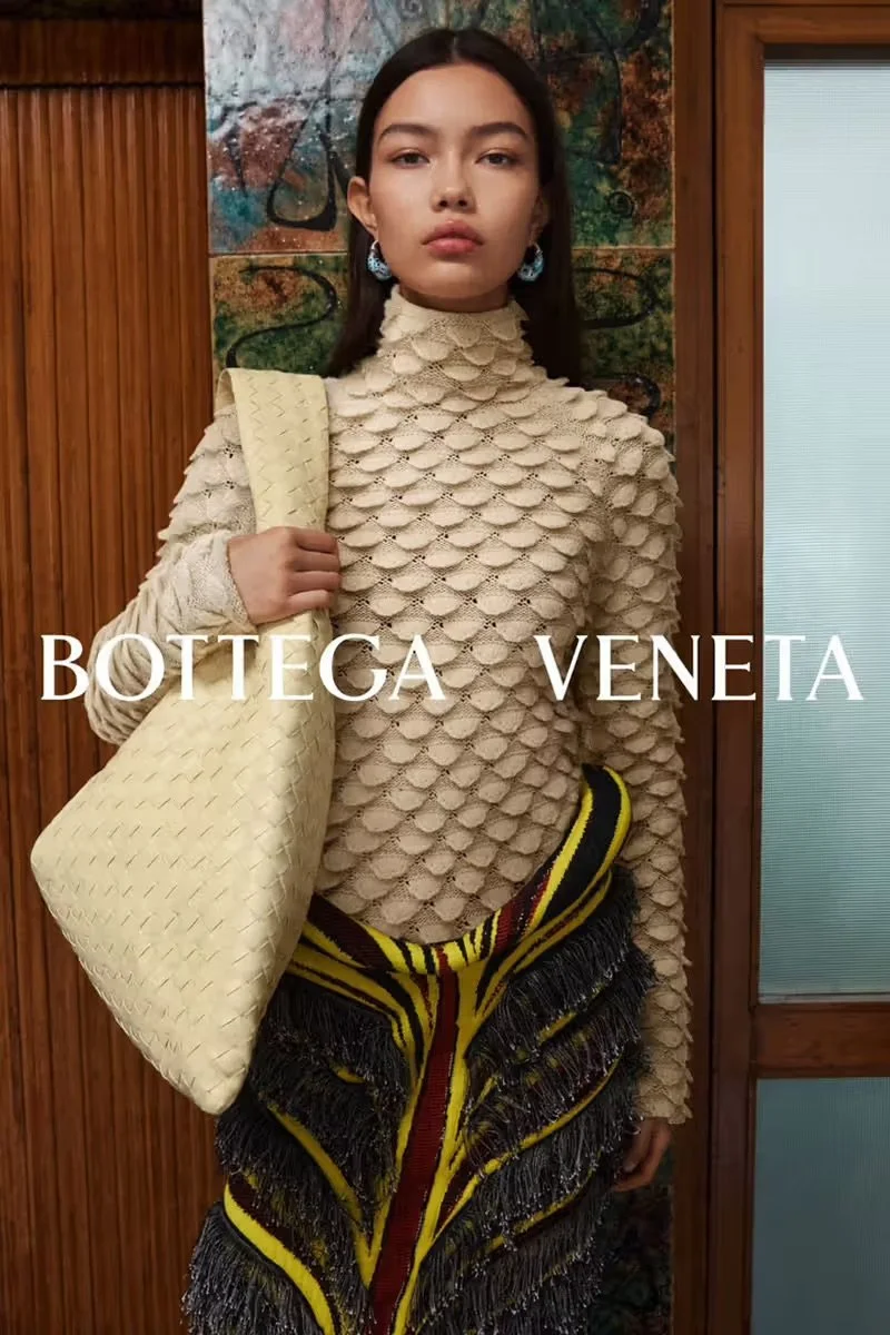

In turn, the culture has shifted towards one where design is at the forefront, celebrating brands like The Row, Bottega Veneta, and Lemaire. But is this shift a form of permanence or just a pause? Fashion, after all, thrives on the pendulum swing. After taking over Chanel, Phoebe Philo followed Ed Hardy’s bedazzled maximalist era with a clean, minimalist look, just as Hedi Slimane’s rock-star skinny suiting answered Y2K synthetic futurism. The anti-logo aesthetic we see today might be less of a revolution, but more of a recoil, a cultural palate cleanser after the visual noise of the hypebeast decade. Brands like Lemaire aren’t reacting against logos as much as offering the inevitable counterbalance to their excess. However, the absence of outward branding may be today's most tangible form in the fashion industry.
Two different brands–Auralee and Lemaire– both sitting at the forefront of the ‘response’ era to logomania, focusing on design and contextualization.
Logos might be gone for now, but if anything about the fashion industry is certain, they will make a return. The culture that once demanded visibility now prefers ambiguity. Still, fashion has a habit of reanimating what it once rejected, and what feels passé today is often just dormant, waiting for the cultural conditions to shift again. The box logo will probably return, but when it does, it will likely speak a different language. Until then, silence is the new signifier, and maybe the loudest logo to wear is none at all.